We use cookies to improve the services we offer you. By continuing to browse this site, you consent to keep them in accordance with our Privacy Policy.
×We use cookies to improve the services we offer you. By continuing to browse this site, you consent to keep them in accordance with our Privacy Policy.
×
 5,752
5,752
 6 min
6 min

There’s hardly anyone on Earth who’s never had to make a presentation. Back in the early days of the digital era we all learned to use PowerPoint, which still remains one of the most popular tools for both casual and business purposes. However, it’s time to face the fact that we’re not in 2000’s anymore (and not even in 2010’s!). The old style of making presentations is yesterday’s news.
It is particularly important to be up-to-date with your presentations when it comes to business matters. The more advanced, high-end software solutions you use for pitching your projects and showcasing your work, the better impression you make. Rather than making a conventional set of slides, why not try making a dynamic video presentation? It’s not as difficult as it sounds – pick a user-friendly Online Video Editor with the right presentation templates and start working! But first, have a look at some advice on what makes a good presentation for your business – it’s not that simple, either.
How to Make a Good Presentation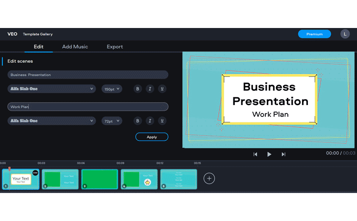
Rule 1: Think It Through First
Before even opening the program, sit down and outline the structure of your future presentation. What is the main purpose of the whole thing: is it a business offer, an idea pitch, a call to action or simply a piece of information relevant to your audience? Once you’ve figured that out, decide on the key aspects you want to highlight. Articulate your key point and give some essential details. Add a couple of illustrative cases if applicable, and include just as much background information as needed (don’t describe the whole history of your business from 1910!). Write your contacts on the last slide so your viewers find it easy to get in touch with you for more. Learn how to create a digital business card to complement and elevate your next presentation.
Rule 2: Be Minimalistic
A presentation is not a book, so don’t try to make it look like one. Instead of writing huge paragraphs in full sentences, compress everything in short bullet points. Ideally you should keep each point on a separate slide. If you would still like to keep your “1,2,3” on one page, don’t include more than 3 or 4 points at once.
Rule 3: Showing is Better Than Telling
Numbers, percentages and trends look much better when presented in graphs and diagrams. There are tons of free online services like this one to wrap your data in the most digestible form. Think creatively and try exploiting other visual tools: algorithms look good in flowcharts, complex instructions can make great mind maps, and so on.

Rule 4: Don’t Overdo Colors
There’s absolutely no harm in using bold shades for your presentation. Colors help grab the viewers’ attention and contribute to creating the right mood. However, you have to be careful with them, as too many shades will distract your audience and make you look less serious. However informal your company’s image may seem, it’s still a business presentation, so better keep it neat. Also make sure your background, text and images don’t interfere with each other.
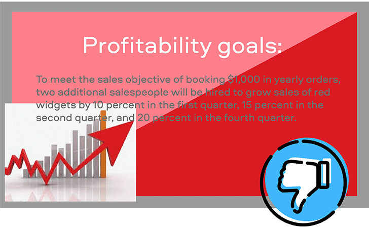
Rule 5: Avoid Generic Illustrations
Don’t put stock photos of graphic humans shaking hands, office workers laughing merrily at their desks, random graphs demonstrating some abstract growth – all of these things don’t add any value to your presentation. Try to use real pictures and graphs which show something relevant to your business. There are certain exceptions, of course. Sometimes you need to show certain trends and schemes in layouts like “A derives from B”, so you might have to use generic images from Google for that. Generally, get a habit of asking yourself why you need this particular image at this particular spot and take it from there.
Rule 6: Mind Your Image Quality
Never use bad quality images in your presentations. Well, unless you absolutely have to (e.g. if it’s an archive image). Blurry or pixelated pictures and graphics look very unprofessional, and that’s not something you want on your business presentation. Look for best quality photographs, particularly if you’re going to present on a big screen. Always opt for vector formats (such as .png) when it comes to choosing graphic objects, as you can easily resize them as you like.
Rule 7: Less Is More
Take it as a general principle: presentations are not meant to be too long. It doesn’t matter if you’re showcasing it physically in front of the audience, putting it up on your website or sending it via e-mail – the rule remains the same. A presentation has to highlight the most important points of the issue to get someone interested. Consequently, the audience will want to find out more – provided that your key points hit the target. For example, if it’s your own project that you’re presenting to your teammates, give them an understanding of what makes your idea worth their work, what are the results you expect to achieve and what makes it all feasible. If it’s a commercial offer for your business partners, give them the benefits of working with you and make your expectations clear. Keep everything short and simple – after all, time is money, and you don’t want to lose money by undervaluing other people’s time.
Have a look at this summary made with Fastreel by Movavi – this is what your company showreel structure may look like with our Corporate Video Maker: