We use cookies to improve the services we offer you. By continuing to browse this site, you consent to keep them in accordance with our Privacy Policy.
×We use cookies to improve the services we offer you. By continuing to browse this site, you consent to keep them in accordance with our Privacy Policy.
×
 15,781
 12 min
Every movie starts with a сhain of logos — it might take up to a couple of minutes to credit all the studios and production companies that helped make the picture. Such intros have become so familiar that they often get missed or overlooked — but some logos remain great short films on their own with a captivating story behind it. We’ve picked the most famous logos and found out what they mean and how they were created.

The man behind the logo was Howard Dietz, an MGM public relations manager who was nostalgic about his time at Columbia University and their sports team, whose symbol was a lion. And that’s why a lion was selected as the emblem of the Metro-Goldwyn-Mayer film studio. The logo was originally created using the picture-in-picture technique: a still image of a film vignette reading Ars Gratia Artis (“Art for art’s sake”) embracing a moving picture of a lion.
As this originally happened in the age of silent films, it was not until 1928 and the start of the talkies that the lion began to roar. However, at first, the sound was separate from the image. The studio used a phonograph to record a lion’s roar and played it in cinemas simultaneously with the video. Some time later, the soundtrack became an integral part of the logo; it was only much later that the video we’re all used to seeing, the one with the lion roaring twice, became the standard.
As this originally happened in the age of silent films, it was not until 1928 and the start of the talkies that the lion began to roar. However, at first, the sound was separate from the image. The studio used a phonograph to record a lion’s roar and played it in cinemas simultaneously with the video. Some time later, the soundtrack became an integral part of the logo; it was only much later that the video we’re all used to seeing, the one with the lion roaring twice, became the standard.
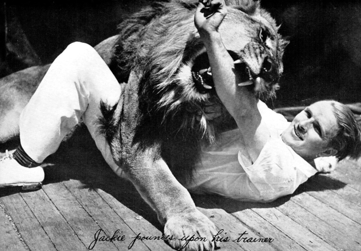
Leo, as well as his predecessors in the role, were not wild predators from the savannah. All were descended from the families of cinematic lions, whose ancestors had starred in films. Those guys even had personal coaches, who sometimes had a hard time getting them to roar like a real wild beast.
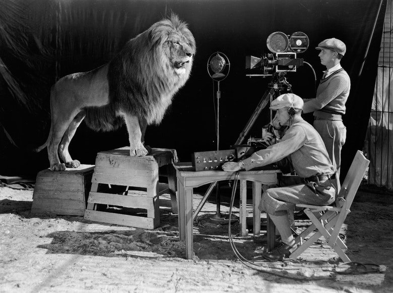
The MGM lions not only starred in the logo, but also worked on studio ads, which meant they had to do a lot of promotional tours. In this respect, the life of the second lion, named Jackie, was definitely worthy of a Hollywood biopic. While touring, he survived two train crashes, an earthquake, a flood, and an explosion during filming. To top it off, the plane with his cage plunged from the sky in the Arizona desert. But Jackie was rescued, survived, was nicknamed Lucky, and continued his career!
The paw prints of the MGM lions can be found on the Hollywood Walk of Fame.
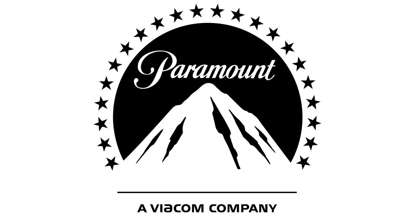
Long before any AI logo generator was developed, the Paramount Pictures logo appeared in 1914. From the very start, the studio staked its future on movie stars, believing that there was nothing better for attracting viewers to cinemas than celebrities. One of the company’s first mottos was “Famous Players in Famous Plays”. The 24 stars in the Paramount Pictures intro symbolized the 24 celebrities hired by the studio.
At some point, two stars disappeared from above the mountain, just because it looked better that way. As for the shining peak, it originated from the childhood memories of William Hodkinson, one of the founders of the studio. Recalling the Ben Lomond Mountain in Utah, he once made a sketch of the peak over lunch with his business partner. The drawing on a napkin showed a snowy mountain peak surrounded by stars. Later, the static picture became a short video which underwent several changes, but always preserved the radiant mountain top and shining stars.
The 20th Century Fox intro was created in the early 1930s. The original video was designed by Emil Kosa, an American artist of French origin. Later in his career, Kosa created elaborate visual effects for many Hollywood movies and won an Oscar for his work on Cleopatra. The view of the Statue of Liberty in ruins at the end of Planet of the Apes is also his work.
The fanfares, so instantly recognizable that anyone hearing them would immediately know that the movie was starting without even looking at the screen, were composed by Alfred Newman, a renowned composer who wrote the music for many famous movies. The logo was modified several times over the course of its history, mostly by adjusting the viewpoints and landscapes. The current version features a panorama of Los Angeles at night in the background, with the famous HOLLYWOOD sign visible on the horizon.
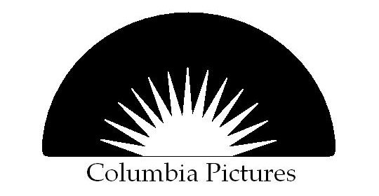
The woman holding a torch is the embodiment of the spirit of America and an obvious clone of the Statue of Liberty. She has always been the symbol of Columbia Pictures, though the studio itself used to have a different name. Established in 1919, the film company was originally named CBC, an abbreviation of Cohn-Brandt-Cohn, the names of the studio’s founders. But people used to mock the name by calling it Corned Beef and Cabbage, then a popular canned food. For obvious reasons, the studio was renamed Columbia Pictures Corporation, which is when the woman with the torch first appeared.
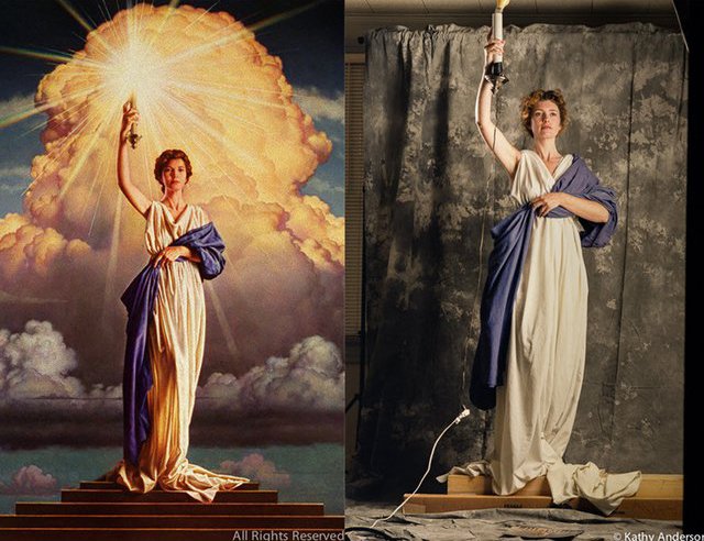
Over the years, many women tried out for the role of the torchbearer: there are versions where she resembles Cleopatra and others a Greek goddess. At some point the Lady Liberty was minimized to just the top of her head.
However, the more complete image of the woman with the torch returned when Columbia was purchased by Sony Pictures. In search of a new model, the artist engaged to create the new version of the intro, Michael J. Deas, traveled to Louisiana and announced a contest. 28-year-old Jenny Joseph, who some claimed was just “an American housewife”, won the contest, but it turned out that she was actually a fellow artist, a muralist. Anyway, the image really only uses her body; the face has become genericized over the years.
This studio’s famous logo owes its existence to four brothers who emigrated to the U.S. from Russia. Upon their arrival in Baltimore, they changed their original last name, Vonskolaser, to Warner and opened their first movie theater. The first Warner Brothers logo was not very different from the current one: it also featured a shield bearing the letters WB, just a little bit elongated. At different times, the design of the intro was modified, the blue sky and white clouds were added to the background and then removed again. In 1967, they got rid of the golden shield… only to reclaim it 20 years later. Today, the shield reflects the studio’s huge hangars, filmed from above, on one of which the studio’s logo is visible.
Despite their global ambitions, the oldest film company in Hollywood had always been considered marginal – it was constantly in debt and was frequently passed from one owner to another. But these difficulties were irrelevant to audiences. What they saw was the image of Planet Earth symbolizing the studio’s all-encompassing perspective, regardless of any temporary difficulties.
A relative newcomer, this company was established by Steven Spielberg, whose idea for the logo was built around a “man on the Moon”. However, it was not an astronaut, as one might expect, but rather the encapsulation of the viewer’s wildest dreams coming true. The logo was originally intended as a reference to the golden era of Hollywood, when dreams really could come true. The concept started out as a fisherman peacefully waiting for a catch on the moon, combining a real photographic image of the moon with that of the man. Later, the man was replaced by a boy, also fishing, but this time sitting on a crescent with his line cast down to a pond on Earth. Robert Hunt, the artist who created the video, used his son as the model for the moon boy.
Walt Disney Pictures split from Walt Disney Productions in 1983 in order to specialize in feature films. While the parent company used Mickey Mouse as its corporate symbol, the first logo of the newly established Walt Disney Pictures used a silhouette of the Sleeping Beauty’s Castle at Disneyland.
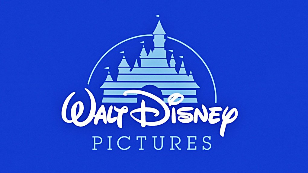
The castle, in turn, was inspired by the Neuschwanstein Castle built by “Mad” King Ludwig II in Bavaria, a source of great fascination for Disney. Could there be a more perfect embodiment of a fairy-tale land than this castle beside a lake and surrounded by mountains?

The present-day logo of the studio was developed in 2006 year using computer graphics, and the prototype castle was changed. The Disneyland castle that welcomes us to the fairytale world now, is Cinderella’s, which was also inspired by a real-life architectural masterpiece: the French Chateau d’Usse.
All Walt Disney Pictures intros also feature a flying spark drawing an arc in the air, with stardust showering down. The spark is actually the tiny and mischievous fairy Tinker Bell from Peter Pan.
This small film company is largely associated with screen adaptations of Stephen King’s novels. The very name of the studio, Castle Rock, is the name of the fictional town in which the action takes place in several of King’s books. The central element of the logo is the lighthouse, which appeared in Needful Things, a movie based on the eponymous novel from the best-selling author.

The Gaumont slogan translates to “Since cinema first began”. And rightfully so, as it really was the first film company ever. Since the studio was created in 1895, its symbol has always been a daisy.
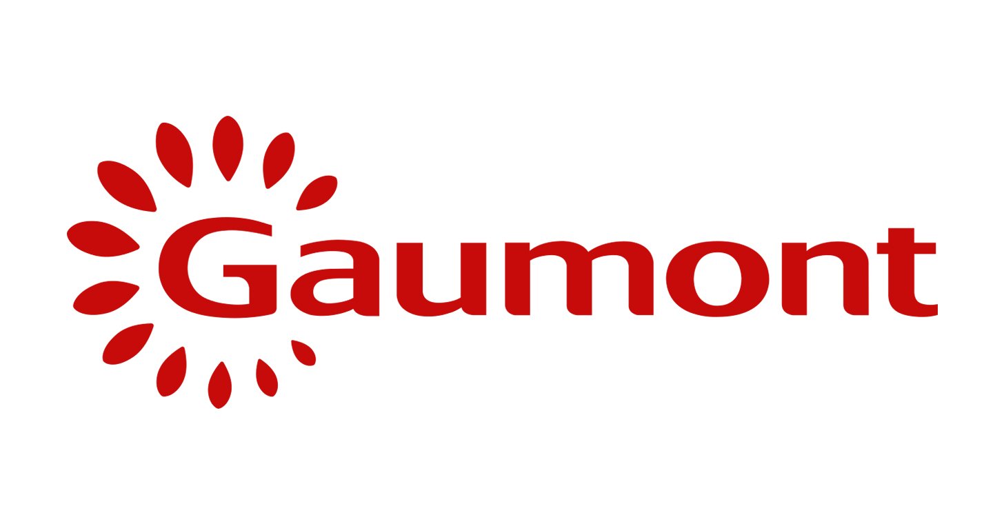
The reason for that is quite poetic: the studio owes its image to the mother of Léon Gaumont, the founder of the company. Her name was Marguerite, which is French for daisy. Over the more than a century that the studio has existed, it has changed many of its bumper videos, but the daisy has always been there, albeit in different colors.
The idea of the video featuring dancing petals was came from the praxinoscope, an old device for showing optical illusions. The music that the petals are waltzing to is the beginning of the famous Casta Diva aria from Bellini’s Norma.
Pathé is only one year younger than Gaumont and has also had a long and eventful history. Taking advantage of his strong entrepreneurial spirit and great love of progress, Charles Pathé, the founder of the Pathé studio, purchased a phonograph, which he used to attract visitors at markets and fairs even before the era of cinema.
The emblem of the studio is a Gallic rooster, the symbol of France. From the very start, it has introduced every reel produced by the studio. The rooster’s name is of course Charlie, the same as its creator. The latest version of the logo features golden letters swaying to light piano music: Charlie appears as a shadow and sings “loud and clear”, which is the company’s motto.
Scott Free is the film company started by Ridley Scott, a British director. Despite his extensive involvement with Hollywood, his studio’s bumper video sticks to the European rather than the Hollywood style. A person running gradually transforms into a bird, thus acquiring the freedom to fly, a metaphor for freedom of choice and creativity.
The creator of the bumper is the Italian illustrator Gianluigi Toccafondo. The animated logo uses the timelapse technique, which means that each character’s movements are drawn separately and then photographed before being assembled into a video sequence.

The cartoon Luxo Jr., released by Pixar in 1986, was the first use of computer graphics in animated films, and garnered tremendous success. It was the first cartoon to be nominated for an Oscar and included in the United States National Film Registry. Interestingly, the model for the protagonist was drawn directly from the film-maker’s desk lamp. Riding the wave of Luxo Jr’s success, Pixar could come up with no better solution for its logo than the young lamp, incorporating into the symbol instead of the letter “i”.
And here is the lamp in Luxo Jr.:
The thuggish logo of Bad Robot Productions was created by its owner, J.J. Abrams. The character and the name of the studio came from an idea he had during a meeting with scriptwriters. As for the sound used in the bumper, those are the voices of J.J. Abrams’s kids.